As crazy as this may sound, not every designer or illustrator is a good brand designer.
The process of creating a logo, at the highest level, is a series of complex tasks that don’t have anything to do with designing. It takes a very unique and specialized skill-set to be able to design logos well.
Today, we are going to demystify the process so you can get better at logo design.
If you are a designer or illustrator looking to specialize in branding, this article will help you understand the complex process behind creating a great logo from start to finish. We’ll be taking you directly into our creative process that we’ve developed over the years to create brands step-by-step as if you are working right next to us. For the purpose of this article and to bring you through the process, I’ll provide my behind-the-scenes work for a client logo I designed for the website, “MindTrackers.”
This is what works for me and my team. This guide is not written as a “this is exactly how your process should be,” but rather this is how I work and you could use it to find and develop what works for you.
So, Let’s get started!
What makes a great logo?
Before we get into our creative process, we’ve got to understand what makes a great logo, great.
When evaluating the merits of a logo there are four critical questions to ask:
- Does the logo express a specific feeling, vibe, or personality that is important to convey to the intended audience?
- Is the logo memorable and distinctive from competitors?
- Is the logo versatile and functional?
- Is the logo well designed and crafted?
So let’s go through each question one-by-one.
Does the logo express a specific feeling, vibe, or personality that is important to convey to the intended audience?
A strong logo will help define what a company is about rather than define what it does. Many times the client thinks a logo has to be literal. For example, a travel company having a logo with a plane, suitcase, or passport in it or a motorcycle company having a logo with a motorcycle in it. However, in reality the logo is an opportunity to convey something more powerful and deeper than that.
If we look at some of the great logos of our time you can see that many of them express something about the personality or culture of the company rather than what it actually does.

Here’s a few examples of this:
- Nike – They have a check mark for their logo which has nothing to do with the sports equipment they sell. It’s more about their culture of, ‘Just Do It’ and inspiring people to be at the top of their game.
- NBC – The NBC logo has a peacock above their text which is looking to the right. This represents the company’s motto to look forward and also each feather represents a category of the programs they broadcast.
- Toblerone – The chocolate company has a mountain with a hidden bear in it. Bern, Switzerland where the company was born is home to the Matterhorn Mountain and also known as the “City of Bears.”
- Museum of London – The purpose of this logo is recount the history of London through all the eras from medieval times to today. While it looks like a piece of abstract art, it’s actually the geographical area of London as it has expanded over the years.
That being said, making an inspiring statement through a logo is not always realistic or called for. Many times, the deeper meaning becomes more apparent later on in the brands’ life. What you can do in the beginning of your logo creation though is set the foundation for what’s to come.
When you’re judging a logo’s merits refer back to your questionnaire the client filled out before you started the project and find the adjective that is most important for the business to convey. Does your potential logo reflect similarities to this adjective? If it doesn’t, you just might want to go back to the drawing board. In fact, I would highly recommend it.
Is the logo memorable and distinctive from competitors?
A great logo is memorable. If people can’t remember what your logo looks like, they won’t remember your brand. Take a look at some of the top companies today:
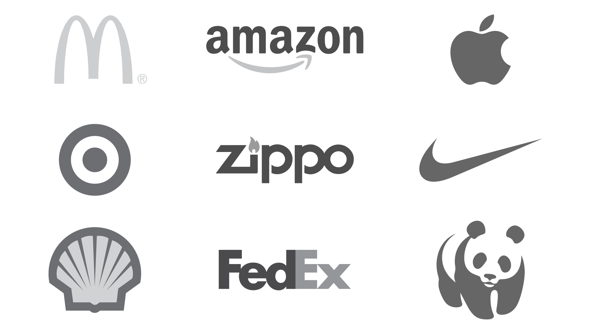
What do all of these have in common? They are simple both visually and conceptually.
How can you tell if a logo is going to be memorable?
If you can’t look at a logo for fewer than 10 seconds and re-draw it with decent accuracy an hour later, it’s likely too complex to be easily remembered.
Your logo is a quick visual cue that conveys the essence of your brand in an age where image is everything and time is short. Awareness and familiarity are keys to growing a business and a memorable logo is instrumental in both areas. The right logo helps solidify customer loyalty while differentiating you from the competition.
While we are on the subject of competition, your logo must also STAND OUT from its competitors.
A simple easy way to test this is to gather all the companies competitors logos and put them all in a row with your proposed logo in the center. Does the logo get lost in a sea of similar shapes, colors, or other visual treatments? Or does it stand out in a positive way?
Is the logo versatile and functional?
An effective logo will be able to work across a variety of mediums and applications from a tiny fav icon to a giant billboard. Over time, you’ll need to use the logo across many different usages.
- Is it legible at a very small size?
- Can it be embroidered?
- Does it work in just one color?
When designing a logo you want to work in black and white until you nail the symbol, icon, and typography as a whole together. Not only does this keep you focused on the concept, shape, and form of the logo, it helps you keep it simple. The logo must look excellent in the most simplest form first before any color is added.
Is the logo well designed and crafted?
This may be a little subjective, but a logo is the face of a business. It’s not just some graphic that’s going to be hidden away inside of a brochure. It will be plastered everywhere. The love, craftsmanship, and technical execution of the logo must be flawless.
- Are the curves smooth?
- Is the typography perfectly chosen to match the vibe of the company?
- Does the typography have similarities with the icon symbol?
- Is the type kerned perfectly?
- Is it visually balanced?
- Does it just ‘feel’ right?
It’s well worth it to spend the time needed to ensure that every detail is perfected. When I design logos I spend a minimum of 30 hours concepting, creating, and perfecting it. I can spend an entire day just searching for the perfect font or tweaking the tiniest of details. The last 5% of a logo creation can take just as long as the first 95%. That tiny difference of perfection, makes all the difference.
If you want to be an excellent brand designer you must spend the time it takes to execute perfection. Everything must work together in perfect harmony. This is another reason to work in b/w first so you can focus on the shape. Make sure each curve, point, and detail is just right. The more you do it, the faster you get!
Now that we know what makes a great logo, let’s start the process.
Before you sign the contract
Create your own unique logo questionnaire
We highly recommend creating your own logo questionnaire rather than using one you downloaded online. This allows you to tailor the questions for not only your specific creative process, but for the type of logos you work on and the type clients you want to have. It also helps you stand out from other logo designers.
Read More: How to create a unique project questionnaire for your clients
Have the client fill out your questionnaire
A word of advice, it’s best to have the client fill out your questionnaire before you make a contract. It’s a good indicator to determine if you two are a right fit for each other.
Send the client your questionnaire and have them fill it out. It’s best to include one or two examples of the kind of answers you are looking for to get higher quality answers.
Start the Brainstorming Process
Understand your client, the business, and their audience before doing anything.
Before you even begin your brainstorming session you need to spend time researching the industry, the audience, and understanding the business through their questionnaire. It’s easy to get stuck in the research phase and use it to procrastinate so I highly suggest putting a timer on your research. When the timer finishes, you must move on to the next stage.
How much time should you spend researching?
The amount of time you’ll want to spend on the research phase depends on the type of logo you are creating. For a wedding logo, you may only need 30-minutes researching the couple. For a start-up in an industry you are unfamiliar with you may want to set aside several hours. This may seem like a lot, but great ideas come from knowledge and understanding.
In the case of MindTrackers the client wanted the best and gave me complete freedom. Since I’m designing everything from the name to the brand to the site layout and user experience, it requires more research than a normal project.
I’m not just building a logo. I’m creating a brand strategy and experience for the site’s users. Who does the site want to target, how can we speak to their hearts, what would they fall in love with, and what to they care about most right now? I helped the client understand their users better and where to focus efforts.
This is why I research the audience before I begin creating. It’s not for me or my tastes, it’s for theirs. By the time I’m finished, I usually have a good idea what the brand should look like. It gives me a clear picture of what I need to create and provides reasoning for each design decision made.
How do you get started with your research?
To get started with your research you’ll want to print out the questionnaire and read through it a few times. Highlight anything that feels important or pops out at you. In the questionnaire you should have several sections that go over who the audience is and their competitors.
This is where you will want to start. Every project is different, but generally these are the things check out.
Research Topics
- Carefully go over the questionnaire and highlight anything important. Investigate anything you don’t understand.
- Research the audience. Find out where their audience is and go discover some stuff about them. Don’t just rely on what the client wrote—most of the time they struggle with this section—so find their pains, struggles, and dreams. This can be an internet black hole so you definitely need a timer for this part. Make notes on anything interesting you find.
- Investigate competitors sites. Take screenshots of their websites and logos. Make any significant notes about their personality, style, etc. You need to stand out from these sites so its important to note their strengths and weaknesses. The screenshots will come in handy for your client presentation later on in the process.
- Get to know the business. Does the client have an existing site or material online you can read? Check it out and try to understand who they are. If they sell something, buy it. Go through the website yourself and see what you notice about the current experience.
During my research, I usually have a piece of paper I write random notes and words on and a .txt file with any pasted text I found interesting. I take screenshots of anything significant so that it can be used in a presentation later if needed.
My research for MindTrackers
For my combined research on the MindTrackers brand and website I read several 100+ page reports on the sites most popular personalities in addition to my competitor and on-site research.
This particular logo design was slightly more difficult because it’s a personality site with 32 different subsections of audience. If you speak to everyone, you speak to no one so it was essential for us to narrow this down somehow yet still appeal to a wide range of personalities. In the end we decided to focus on the most popular personality group and most likely to be interested in the site concept (eventual customers).
Inside the MindTrackers questionnaire I found the following answers interesting.
- Google’s driverless car. Tell me what you are like, I will tell you where to go.
- New York. Many possible paths, but you would need to choose wisely.
- I’d like to avoid bright, action-oriented colors as our audience is likely to expect something calming and reassuring, not screaming at them with excitement.
- A place that allows people to discover who they really are, gives them a clear, individual A-Z plan for personal development, and enables them to communicate with others like them.
- Curious, imaginative, idealistic, seeking growth and authenticity.
- The logo should reflect growth (so perhaps something with mountains, hills or forests, paths going up and so on), maybe companionship (e.g. someone offering a helping hand or pointing in a specific direction), and maybe something showing a conscious decision (e.g. having a stick and a backpack [=preparedness] vs. randomly stumbling upon a strange path). We just need to be careful with mountain imagery – it seems like an obvious choice, but it also differs from the tracker concept (you don’t do much tracking while climbing, there is usually one clear route). There will be lots of different paths and you may need to explore one, then go back, try another, then go back again to double-check something etc. – instead of simply climbing the mountain and being done with it.
Join our e-mail community and download the MindTrackers questionnaire here.
Most small business owners struggle when defining their audience
If you’re like me and love solving design problems strategically, then here’s how you can add value to your logo design service. Take that questionnaire and go learn some stuff about their audience. See what you can find. Grab some quotes from their readers. See if you can help say what the client’s been struggling to put into words. If your client is smart, they’ll understand the value.
You can later take this and add it to your logo presentation to sell your concept. When you back up your creation with research and facts, it’s hard to deny your expertise.
During my research for MindTrackers I was able to take the site from a really broad general audience to a single focus. This made a huge difference for everything that followed.
Once I know who this person is, I know what they want, dream about, and desire. I can design a user experience based on what they need and want. Once of the tiny things I learned from my research is that creating a deeper story in the logo would be meaningful to this audience.
A big part of leveling up your business is figuring out where you can add more value to the process for your clients.
Start your MindMap
So now we need to find our idea. What could it be?
The first part of the process is to try and make some idea connections. You want to make a listing of all the words, references, items, etc that came out of your research. The scribbled paper from earlier, the words you highlighted, etc. It’s time to research those words online and see what kind of connections can be made.
From the questionnaire I pulled out a few themes:
- Road Map, Blueprint, and Compass
- Independence
- Community
- Growth
- Indian Trackers (based off the story behind the MindTrackers name)
- Possibility
Next to each main word I try to sketch a little icon for it, even if it’s really bad. You just want to get the general shape. This makes it easier to connect ideas later on when you’re done with your mind map.
Below, after some online research I filled out my mind map.
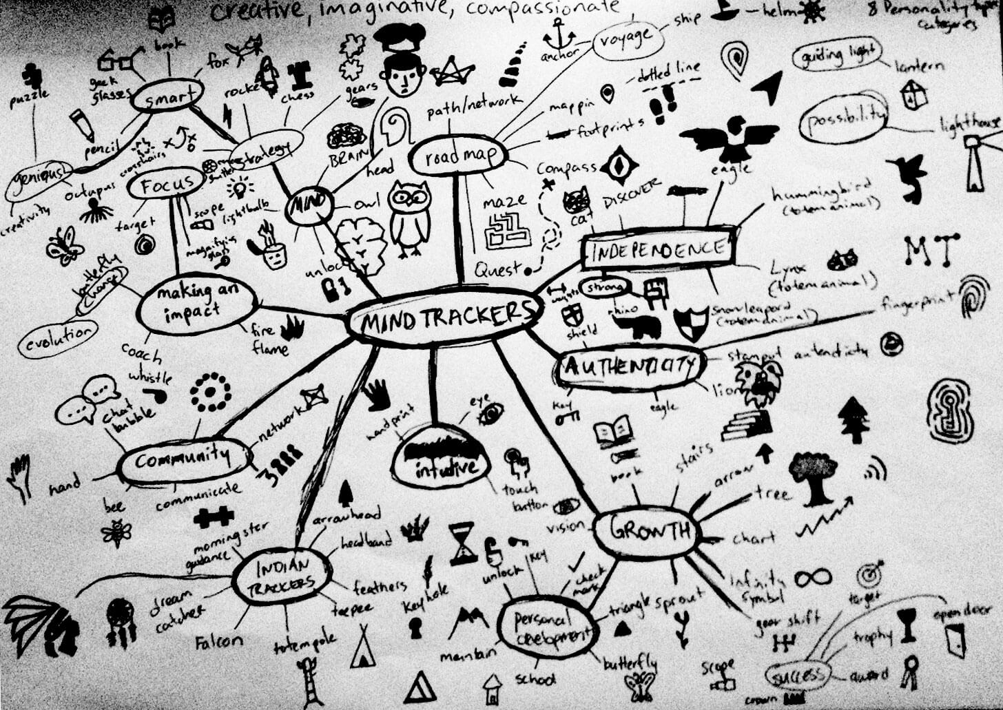
After, I’ve written all my words down and drawn my little icons it’s time to try and connect some ideas. At this point, I’m looking for shapes that are similar or unique patterns that could be combined with an object. Looking at all of this a few concepts start to emerge for me.
The emerging concepts
- brain + maze
- 2 brains drawn as mazes, but also look like 2 chat bubbles
- brain + maze – path inside creates a simple symbol like – key, magnifying glass, etc.
- compass + keyhole
- mind + tree
- head as an unlocked lock
If you don’t like any of your ideas, keep pushing.
I made some more detailed sketches. They are pathetic. I wasn’t satisfied with the ideas that came out so I kept pushing. Sometimes you have to dig deep for a great idea to emerge.
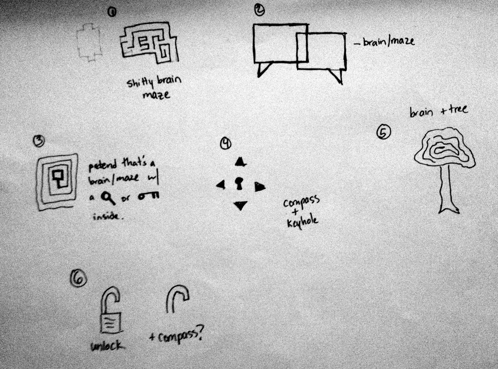
If you haven’t noticed my sketching is just okay. I can get the point across, but I’m not an amazing illustrator. Many of the ideas I had I was unable to technically create, like this Reddit Misfits logo.
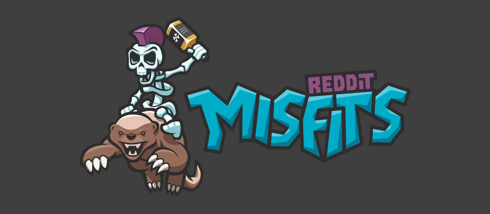
They were far beyond my drawing ability. I had the vision, but not the technical drawing talent. So I started hiring illustrators to help me execute what I couldn’t.
Alone, it is not our strong suit, but we can make something of really high quality together. I bring the concept, typography, style, and strategy behind the logo and the illustrator visualizes the idea and creates the mark. We work closely together to make tiny tweaks. Often times passing source files back and forth so we can both play with the files.
Not happy with my concepts yet, I create another mind map exploring the Indian, compass, mind, and radar themes. I’m pushing a little further down this direction to see if I can create something better. To get ideas for my search or examples of style I go hunting for inspiration. I use Dribbble, logolounge.com, and googling for meanings to add ideas to my mindmap.
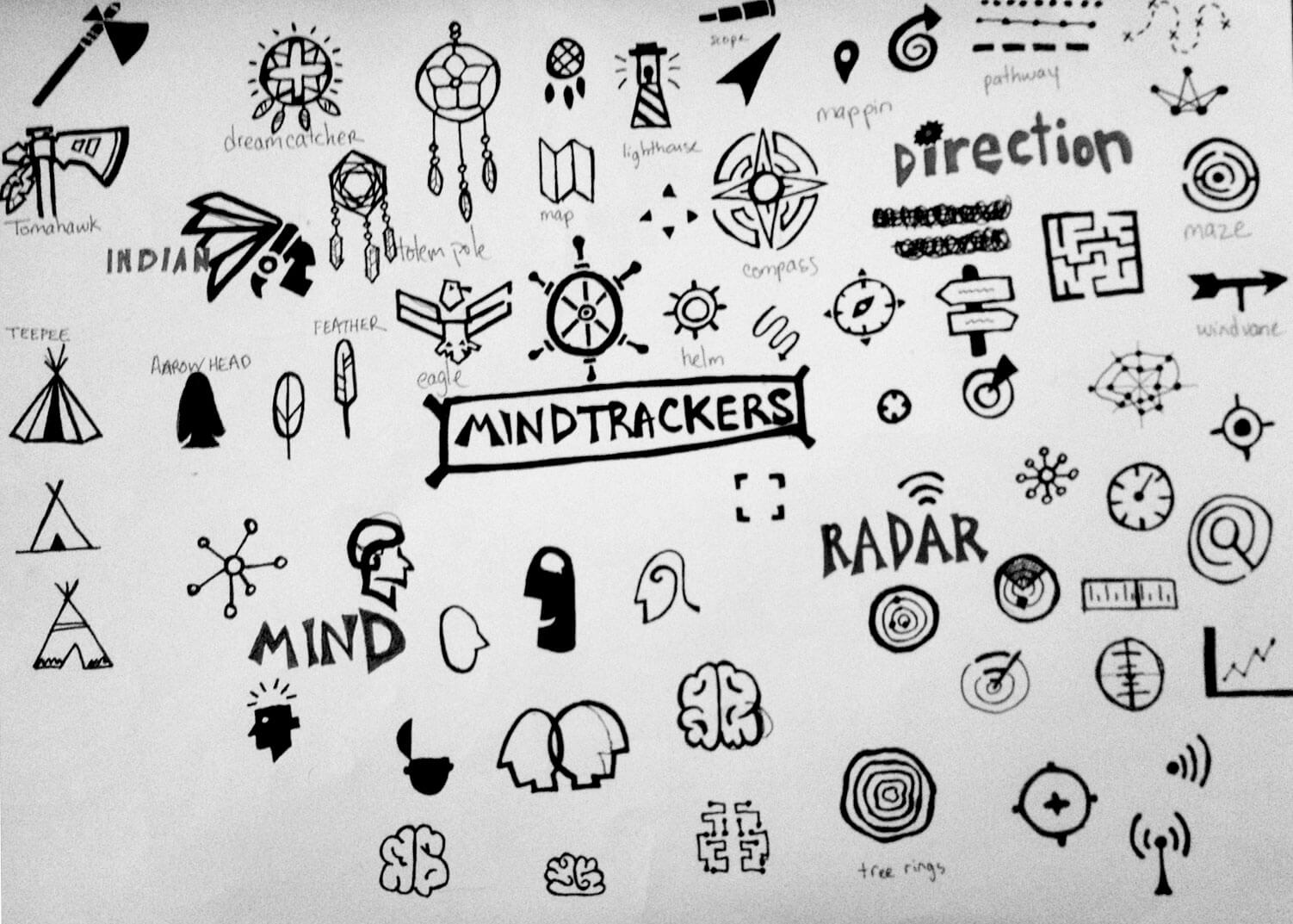
After pushing this a little further I thought a dream catcher that was either a radar or maze or something would be a good concept.
So I sent this over to the illustrator:
MindTrackers is a site that helps you better understand who you are and how to use that to get what you want out of life.
The main product is a subscription based map/quest system that helps you explore various areas of your life and work to improve them.
While the client was on vacation and the “MindTrackers” site idea was brewing he was in the Southwestern United States where we have a lot of Indian reserves and history. When we were searching for names we saw that ‘trackers’ can also mean the Indians who use animal tracks to find and hunt food for their family/community.
In the case of MindTrackers, it’s Millennials that want to learn about who they are and how to find their way in the world with a focus on the most popular type.
Key themes to convey:
- finding direction / clarity / focus
- growth (personal development)
- following a path made just for you / guidance
- exploration / road map
- personalization / unique / individual
Simple symbols that represent these themes:
Brain, compass, maze, fingerprint, solid or dotted path line, tree, map, map pin, key, lock, helm, radar, mind, arrows
I think that the dream catcher can be combined with some of the other circular symbols like compass, maze, radar, helm to create a unique symbol for Mind Trackers.
I’d like you to sketch a bunch of dream catchers with various elements from each of these ideas, plus any that you find inspiration from the mind map.
- helm
- maze
- path / one continuous line / dotted line / dot-to-dot
- radar
- compass
I’m not going to set a number of sketches, but I’d like to see more thumbnail/rough sketches that explore how simple/complex it can be, different shapes that can be explored, what details you can remove and not lose context, what elements can overlap each other, etc. At this stage I care more about quantity and exploring available options.
This is what I got in return. I’ve found that I get better results when I choose a specific idea and have him make variations of that one idea. Rather than a more generalized set of instructions.
It really depends on the person you are working with and finding what works best for both of you.
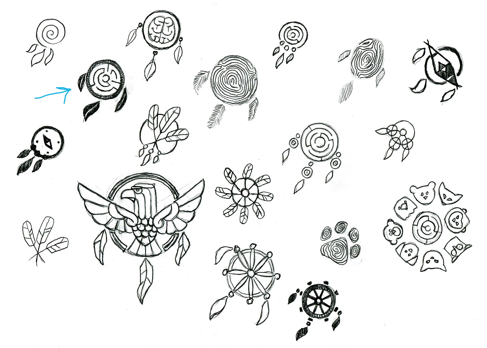
Most of these are not right. But, this one is closest to what I imagined so we’ll start there.
My Feedback: I really like the top left one that’s checked marked. Can we make some variations of that one? The one with the maze inside of the dreamcatcher. That’s by far my fav. (ie. v3 in the mock ups)
I would play around with the feathers a little bit, a few different variations of those… I like the thick outline and the simple maze. So those could stay as is.
Then, while I’m away moving to Bangkok the client decides to give some feedback in Asana while I’m out. It’s the first time I’ve been in a really open environment with the client. While we have boundaries, they can see most of the creative communication I have to and from my team and work right beside us. They have value to add about their audience and we discuss the vision and strategy together. The client will often upload work-in-progress stuff as we work with iterative approach to building. It makes me cringe a lot, but that’s the philosophy behind the site build.
I’m telling you that because I came back to this.
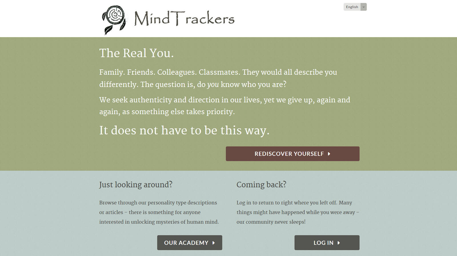
?
Typography
We’re at a crossroads here. I need to find the font or we’re never gonna be able to finalize those feathers and continue creating the brand. We desperately need to get rid of that atrociousness we see above.
I don’t want it to be just any font, I want it to be THE Font.
When looking for fonts the site I use exclusively is myfonts.com. For my creative process I find this to be the most user friendly website for fonts. Not only do they have a huge library, but it’s super easy to view fonts and add to an album as you go. The page loads infinitely so you never have to click next.
It’s easy to scroll through fonts and see which ones might work for your project.
I believe that for a great logo, you must have the right font in order for it to look perfect. This means searching beyond free fonts or the library you just happen to have on your computer. It means finding a font to buy that is unique and perfect for the project or having one drawn from scratch.
Begin your font search
First, make sure to change the demo text to your logo name. Its important to see the exact letters in the logo in the preview. Then start your search by searching the brand adjectives representing your logo.
![]()
For MindTrackers I start searching for words like “friendly” “modern” “strong.” Each time I come across a font that feels good I add it to an album named, “MindTrackers.”
You can see the MindTrackers fonts I picked out on MyFonts here.
Whittle your album down to the very best
After you’ve been searching a while go back to check your album. There is no minimum or maximum number of fonts you should have in this folder. You should do this until it feels like you have a good selection to whittle from. It could be 60 or it could be just 8. It depends on how selective you decide to be when adding fonts to your album.
When you look at all the fonts together in a group that you picked out as a potential, you’ll immediately start to see things like, “wow that looks like crap” or “ohhh, that’s a keeper.” So go through and eliminate any you can. Delete from your album.
Sometimes, there is one that stands out so much you immediately know, “that’s the one” and there is no question about it. This is what happened with the MindTrackers logo, but font finding missions do not always happen like that.
Play around, until you find the one ?
Most of the time, I need to play with the fonts and icon together. If the font is on TypeKit I’ll just activate it, otherwise I’ll have to screenshot the font (Cmd + 4) and play with the image and icon in illustrator to see if it looks good or not. Sometimes, I’ll find I need something custom drawn.
For MindTrackers it was clear, Brooklyn Samuels Five Medium was the winner. It was soft and friendly, yet bold and strong. It had one really unique ‘k’ letter letter that stood out among the others. It was perfect.
![]()
Make it all work together
So now that you found the font we’ve got to go back to the icon and and make harmony.
The main issue I see with where we are at with the icon is that it’s not strong enough. Those feathers look weird off to the left and their shapes are wack. I’m also not so sure on the maze anymore.
![]()
They don’t pass the small size test nor does the design scream dream catcher. It’s not obvious enough.
Before I take this file and start playing with it though, I go get a bunch of inspiration for feathers. My favorite spots to look are: Dribbble, Logo Lounge, Logo Pond, istockphoto, and Google image search. I paste those into my artboard and begin working on some new feather shapes.
You can see my work-in-progress here:
![]()
I’m playing with the feather shape trying to get it to feel just right for the dream catcher. Eventually, I find what works.
![]()
So I send the file back to my illustrator and ask “what would a radar look like with these feathers? Can you give me some options and fix the feathers I made?”
I get 3 radar options back and by far the first is my favorite.
![]()
The logo feels really balanced and it attracts your attention the way it should. The radar felt complete with the name “MindTrackers.” The radar made more sense conceptually with the name that the maze did.
So we ditch the rest and move forward with the top radar version. The final thing we need to tweak now are the feather notches. I have the illustrator make sure that the curves in the feather match the curves with the font. Then we play with angles of slits.

Then we get here:
![]()
We do this together so it’s important everyone’s happy with the result.
The final logo tweaks
From here I need to kern the typography. The way I kern is to play with the letter spacing and see what feels right. I blur my eyes to focus on the spaces between the letters. Do they feel balanced? If not, what would make it feel balanced? I also turn the words upside down so I can concentrate more on the spacing than the letters.
I learned how to kern using the Kerning Game found here. Just keep playing until you get a good score. This is literally, the only thing I did to learn kerning.
So I played around with the MindTrackers kerning and eventually settled on the following:
![]()
The logo is now complete. Wait a second… the ‘d’ and the ‘T’ should be closer together. Let’s fix that.
![]()
There we go. ?
Review Your Work
According to the four principals of a great logo we went over earlier. We have some questions to ask ourselves about the work we just completed.
Does the logo express a specific feeling, vibe, or personality that is important to convey to the intended audience?
Yes. The logo feels friendly and calm yet strong and powerful. The site idea was created from the inspiration found in the SouthWestern United States—Indian Country. The name MindTrackers was inspired by it.
Tracking in hunting and ecology is the science and art of observing animal tracks and other signs, with the goal of gaining understanding of the landscape and the animal being tracked (quarry). A further goal of tracking is the deeper understanding of the systems and patterns that make up the environment surrounding and incorporating the tracker.
The practice of tracking may focus on, but is not limited to, the patterns and systems of the local animal life and ecology. Trackers must be able to recognize and follow animals through their tracks, signs, and trails, also known as spoor. Spoor may include tracks, scat, feathers, kills, scratching posts, trails, drag marks, sounds, scents, marking posts, the behavior of other animals, habitat cues, and any other clues about the identity and whereabouts of the quarry.
The skilled tracker is able to discern these clues, recreate what transpired on the landscape, and make predictions about the quarry. The tracker may attempt to predict the current location of the quarry and follow the quarry’s spoor to that location, in an activity known as trailing.
Prehistoric hunters used tracking principally to gather food. Even in historic times, tracking has been traditionally practiced by the majority of tribal people all across the world. The military and intelligence agencies also use tracking to find enemy combatants in the bush, land, sea, and desert. 1Source: Wikipedia
The meaning behind the name and logo tell a story about what the site imagines itself to be for people.
A dreamcatcher is one of the most iconic Indian symbols and gives meaning to what the site intends to do. Catch peoples dreams, help them decode it, and guide them towards action. To help them achieve the impossible with custom personality-based courses and guides.
Is the logo memorable and distinctive from competitors?
Yes. The logo stands out next to it’s competitors. Most of their sites look like they are from 1982. We have set up MindTrackers to be a premium brand in the industry.
Is the logo versatile and functional? It works in both black/white and small sizes.
You can see how the logo works at various sizes here. When the dream catcher gets too small, we can drop the feathers and make the red slice black to retain shape. This would be for small items like the .fav icon that goes at the top of the browser tab and any other tiny applications. It looks pretty good until you hit size #5 so switching to the radar only at that size makes sense.
![]()
Is the logo well designed and crafted?
I would hope so! ? We made sure to choose a font that nailed the personality of the site. After, we matched the curves in the icon to the curves in the font making them work in unison. Lastly, we kerned the name MindTrackers and added some color.
Conclusion
This is my logo process from start to finish on a real client project.
The point of the MindTrackers brand was to establish a base for the beta version to hang on while the site’s functionality was being developed. This is where the brand will stay for now, until it can be picked up again.
Next, the brand will need to define a color scheme and create a style tile demonstrating how certain elements could be styled on the website. This will start the foundations of the website design.
I hope this article helped you understand the mechanics behind designing a logo better. If you’d like feedback on a logo you’re working on, post it in the comments below for some honest feedback.
References
| 1. | ↑ | Source: Wikipedia |